Color Contrast Checker
Check if your chosen text and background colors meet accessibility standards. WCAG 2.2 requires a contrast ratio of at least 4.5:1 for normal text and 3:1 for large text.
Key Takeaways
- Focus on real users and keep the experience simple.
- Make every page work flawlessly on phones, tablets and desktops.
- Trim down page weight so pages load in under three seconds.
- Choose readable fonts, clear hierarchy and purposeful colours.
- Design for everyone, including people with disabilities.
When building a site, Web design is the process of planning, creating, and maintaining websites so they look good, work well, and meet business goals. Over the years designers have boiled the craft down to a handful of timeless principles. If you master the five golden web design rules, you’ll avoid the most common pitfalls and deliver sites that visitors actually enjoy using.
Rule1 - Prioritize Real‑World User Experience (UX)
At its core, User experience covers all aspects of how a person feels when interacting with a website, from navigation ease to emotional response matters more than any flashy animation. A user should never have to guess where to click, how to find information, or why a page looks confusing.
- Know your audience. Create simple personas - a busy shopper, a curious reader, a support seeker - and map the critical tasks each persona performs.
- Keep the layout intuitive. Follow the natural F‑pattern for eye movement; place the most important content in the top‑left area and keep primary calls‑to‑action (CTAs) above the fold.
- Limit choices. Too many menu items overload the brain. Aim for 5‑7 top‑level options and use sub‑menus wisely.
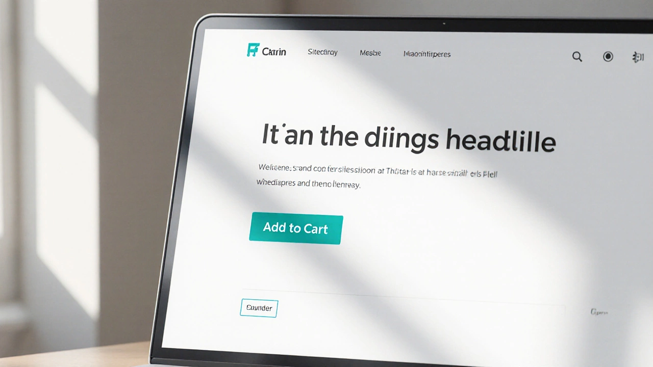
For example, an e‑commerce site that placed the "Add to Cart" button at the bottom of long product pages saw a 12% drop in conversions. Moving the button higher and using a contrasting colour lifted sales within a week.

Rule2 - Ensure Mobile‑First, Responsive Design
Mobile responsiveness means a website automatically adapts its layout, images and navigation to fit any screen size, from smartphones to large monitors isn’t optional any more - Google’s mobile‑first indexing makes it a ranking factor.
- Start designing on a small canvas (320px wide). Sketch the essential layout without any sidebars.
- Use fluid grids (percentage‑based widths) instead of fixed pixel values.
- Apply CSS media queries to adjust typography, spacing and navigation for larger screens.
A case study from a UK news outlet showed that after switching to a mobile‑first framework, page views per session rose from 2.3 to 3.6 and bounce rate fell by 18%.
Rule3 - Optimize Page Load Speed
Page load speed measures how quickly a browser renders visible content after a user requests a page directly influences user satisfaction and SEO. Aim for a **Largest Contentful Paint** under 2.5 seconds.
- Compress images. Use WebP or AVIF formats and serve scaled‑down versions via srcset.
- Minify CSS & JavaScript. Remove whitespace, comments and unused code. Tools like CSSNano or Terser do the job automatically.
- Leverage browser caching. Set appropriate Cache‑Control headers so repeat visitors don’t reload static assets.
- Use a CDN. Deliver assets from edge servers close to the user’s location.
One small business in Birmingham reduced its average load time from 4.8s to 1.9s after implementing these steps, and reported a 22% increase in contact‑form submissions.
Rule4 - Apply Clear Typography, Visual Hierarchy & Colour Contrast
Good Typography covers font choice, size, line height and spacing that together make text readable and scannable works hand‑in‑hand with visual hierarchy - the way elements are arranged to guide the eye.
- Choose web‑safe, legible fonts. Sans‑serif families such as Inter or Roboto at 16px base size work well on screens.
- Establish a hierarchy. Use larger headings (H1, H2) for primary topics, medium‑sized sub‑headings (H3) for sections, and normal body text for details.
- Maintain sufficient colour contrast. The WCAG 2.2 AA standard requires a contrast ratio of at least 4.5:1 for normal text. Online tools can calculate this instantly.
Imagine a blog that uses light grey text on a white background - it looks sleek, but most readers will struggle to read it, leading to early exits. Switching to a darker shade (contrast ratio 7:1) kept visitors on the page 15% longer.

Rule5 - Design for Accessibility & Inclusive Use
Accessibility means anyone - regardless of ability - can perceive, understand, navigate and interact with your site. It isn’t just good ethics; it’s a legal requirement in many regions, including the UK’s Equality Act.
- Provide semantic HTML. Use proper heading tags (H1‑H6), lists, and landmarks so screen‑readers can interpret structure.
- Add alt text. Every informative image needs a concise descriptive attribute.
- Ensure focus order. Keyboard users should tab through interactive elements in a logical sequence.
- Test with assistive tools. Tools like axe or Lighthouse flag common violations.
A charity website that added ARIA labels and proper heading hierarchy saw a 30% lift in donations from users accessing the site via screen readers.
Quick Checklist - The Five Golden Rules
| Rule | Key Action | How to Verify |
|---|---|---|
| 1. User‑Centred UX | Map personas, limit menu items, place CTAs above the fold | Heat‑map analysis, click‑through rates |
| 2. Mobile‑First Responsiveness | Design on 320px canvas, use fluid grids, apply media queries | Google Mobile‑Friendly Test, viewport resizing |
| 3. Fast Load Speed | Compress images, minify assets, enable caching, use CDN | Lighthouse >90, < 2s LCP |
| 4. Clear Typography & Hierarchy | Choose legible fonts, set heading sizes, meet 4.5:1 contrast | Contrast checker, readability scores |
| 5. Accessibility | Semantic HTML, alt text, logical focus order, ARIA labels | axe audit, WCAG AA compliance |
Frequently Asked Questions
Why are these five rules called “golden”?
They’ve stood the test of time across devices, browsers and user expectations. Ignoring any one of them usually leads to measurable drops in traffic, conversions or compliance.
Can I apply all five rules to a single‑page website?
Absolutely. Even a one‑page layout needs clear hierarchy, fast loading, mobile optimisation and accessibility. Focus on concise UX flows and keep the page under 2MB.
How do I test colour contrast without a designer?
Free online tools like WebAIM’s Contrast Checker let you paste hex codes and instantly see the ratio. Aim for ≥4.5:1 for normal text and ≥3:1 for large text.
What is the fastest way to improve page speed on an existing site?
Start with image compression and enable browser caching. Those two steps alone can shave off 1-2seconds for a typical content‑heavy page.
Do these rules differ for e‑commerce vs. blog sites?
The core principles stay the same, but e‑commerce sites put extra weight on clear CTAs, secure checkout flows and product‑image optimisation.