If your website looks boring or cluttered, most people won’t stick around long enough to see what you offer. A sloppy first impression pretty much kills your chances. But even if you don’t have a massive budget, you can upgrade your site’s look with a few smart moves.
Start with your color choices. Set one or two main colors and stick to them—you don’t need a rainbow. Tools like Coolors or Adobe Color Wheel make it stupid-easy to try out color combos before you commit. It’s wild how just making your colors consistent can make your whole site look more put-together. Ever see a site where the header is blue, the buttons are orange, and nothing matches? Annoying, right? People notice this stuff—even if they don’t know why it feels off. One trick is using a bold accent color for calls to action, like 'Buy Now' or 'Sign Up' buttons, so they jump out without screaming.
It’s not about being fancy; it’s about looking polished and not distracting visitors with random design choices. You want them focused on your content, not your clashing background and unreadable links.
- Color Choices That Pop
- Layout Tricks for a Cleaner Look
- Images and Visual Assets That Work
- Little Details that Make a Big Difference
Color Choices That Pop
People usually judge a website in about 50 milliseconds, and color plays a big role in that snap decision. Picking the right colors isn’t about adding a bunch of shades; it’s about keeping things simple and using color to guide people’s eyes.
Start with a main color for your brand. This should show up on your logo, main buttons, or key sections. Then, pick one or two supporting colors that fit well with the main one. Sites like Coolors and Adobe Color Wheel take the guesswork out, letting you see combos that actually work together.
Here’s a basic recipe for website color that never fails:
- Website design always starts with a base color (think background, sections).
- Pick a primary accent color—this stands out for important stuff like your 'Sign Up' or 'Contact' buttons.
- Add a neutral color for text (usually black, dark gray, or white) so everything is readable.
If you want your call-to-action buttons to pop, use your accent color only for those. Don’t scatter the accent color everywhere, or it loses its punch. Blues and greens feel trustworthy, while oranges or reds make things energetic—but don’t overdo bright shades unless you want to look like a circus. Check your color contrast, too. There are free tools online to make sure your text stands out against the background. The easier it is to read, the longer people stay.
Stay consistent. If every page uses different colors, your site just feels random. Stick to your set palette across all pages and keep everything looking sharp and professional.
Layout Tricks for a Cleaner Look
Poor layout is a vibe killer. Clutter drives people off your site fast, but a few layout tweaks can make everything easier to find and way less stressful to look at. The truth? Most folks expect modern sites to just feel simple, organized, and not crowded—think about how Google or Apple design their pages. There’s a reason for that: eye-tracking studies show people scan in patterns like “Z” or “F” shapes, hopping quickly between important bits.
Here’s what actually works when cleaning up your layout:
- Stick with a simple grid. Use columns and rows to separate stuff—tools like Figma or Canva even have grid systems baked in.
- Embrace whitespace. Blank areas aren’t wasted—they break up sections so users aren’t overwhelmed. Extra space around images and text makes everything pop.
- Group related things. Don’t toss a button next to a random bit of text. Put similar content close together and use boxes or colored backgrounds, so it’s clear what belongs.
- Limit the number of menu items. Studies from the Nielsen Norman Group show that fewer navigation choices mean users find what they need faster. Four to six main menu links is a sweet spot.
- Keep headers short and clear. People barely read online—they scan. Make section titles punchy so visitors know what’s next without thinking.
Want a quick win? Use a single main column for your website design on mobile. Forget sidebars—stack sections vertically. This helps small-screen visitors (which is about 60% of all web traffic right now) browse without pinching or zooming.
Last tip: preview your site on different devices before you hit publish. A boss layout on desktop can look like absolute chaos on your phone. Most page builders let you switch views between desktop and mobile with a single click.

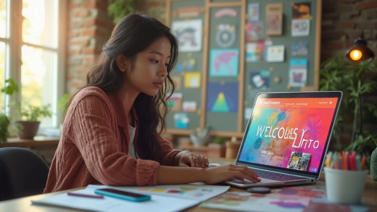
Images and Visual Assets That Work
Images can make or break your site’s vibe. People remember visuals more than text, and stats show that websites with good images keep visitors around way longer. But grabbing random stock shots? That’s a one-way ticket to looking generic. The best move is to use real photos of your product, team, or work in action. No one wants the same handshake photo they’ve seen a hundred times.
High-res images load slowly if you don’t resize them, though. Research from Google found that if your site takes longer than three seconds to load, over half your visitors bounce. So, shrink your images without killing the quality—tools like TinyPNG or Squoosh are awesome for that. For banners and big sections, JPGs work well (balance of quality and size), while PNGs are best for logos and stuff that needs a clear background.
Icons and vector graphics always look sharp at any size, plus they feel modern. Tools like Flaticon and SVGRepo offer tons of free options. Just pick a style and stick with it across your entire site. Mixing cartoonish icons with super-flat ones makes things look messy.
- Use up-to-date images, not ones from a decade ago.
- Add captions or alt text for SEO and accessibility.
- Keep image sizes under 300KB if you can—most websites load faster this way.
- If you embed Instagram posts or YouTube videos, preview on mobile before publishing.
Check these real numbers about visuals and engagement:
| Fact | Source |
|---|---|
| Posts with images get 650% higher engagement | WebDAM (2024) |
| 94% of first impressions relate to website design | Stanford Web Credibility Research |
| Product photos shape buying decisions for 75% of shoppers | Shopify (2024) |
The bottom line? Pick sharp, real images and keep them fast and fresh. You want people to scroll, not bounce.
Little Details that Make a Big Difference
Dialing in the small stuff on your site can have a much bigger impact than people realize. These tweaks aren’t flashy, but they’re exactly what separates a "meh" website from one that actually feels legit and easy to use.
First up—fonts. Pick no more than two fonts for your whole site and make sure they’re readable on every screen size. Google Fonts gives you a ton of free, easy-to-read choices. If your text is hard to scan or bounces between different styles, people just check out. Use size and weight (bold/regular) to help guide the eye, instead of playing with wild font styles.
Spacing is another deal breaker. Notice how sites with breathing room feel calmer? Give your text and images enough space so nothing feels cramped. Try padding and margin settings to see what actually feels better. Tight sections set off alarms that your site isn’t well built.
Don’t forget interactive touches. Button hover effects, link color changes, and quick feedback when someone submits a form—all of this makes your site feel alive. Basic things like animated loaders or pulsing buttons help users know stuff’s working, without getting in their way.
Even your image quality makes a difference. Blurry, stretched, or pixelated images tell people you don’t sweat the details. Quick stat: website design choices like image quality and load time impact how credible your business appears—studies show that 75% of users judge a company’s trustworthiness based on their website.
Check out how these little details stack up:
| Detail | How It Helps |
|---|---|
| Consistent Button Styles | Makes actions clear, boosts clicks |
| Clear Navigation | Keeps people from bouncing, more pages visited |
| Accessible Text Contrast | Improves readability for everyone |
| Responsive Images | Looks sharp on phones and laptops |
| Loading Indicators | Lowers drop-offs while waiting |
If you nail the details, people may not even notice what’s working—but they’ll definitely notice if you ignore them. Run your site through free tools like Google’s Lighthouse to catch stuff you missed. Polish the basics, and you’ll look way more pro—even if nobody can put their finger on exactly why.