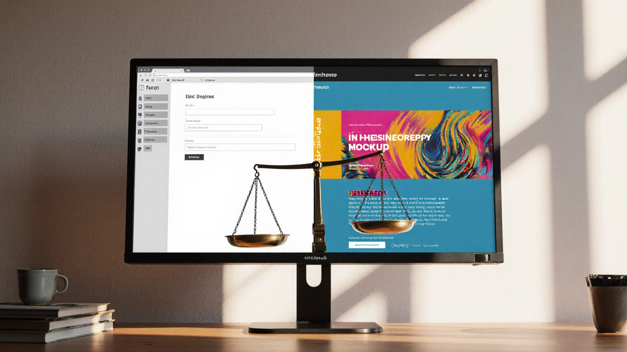
Usability vs Aesthetics Balance Calculator
How This Calculator Works
Rate your website design on key aspects using a 1-10 scale. The calculator shows your balance and provides actionable feedback to improve.
Web design is the craft of creating websites that look good, work well, and meet business goals. Every project throws a handful of competing demands at you, but two ideas keep resurfacing: how beautiful a site feels and how easy it is to use. If you’ve ever stared at a stunning landing page that left you baffled about where the "Buy" button lives, you know the tension. This article breaks down why that tug‑of‑war exists, how to keep it from tearing your project apart, and what extra factors you should keep on your radar.
The Core Pillars: Usability and Aesthetics
When anyone asks what you must balance, the answer usually lands on usability and aesthetics. They’re not just buzzwords; they’re concrete goals that drive every design decision.
Usability is the ease with which visitors can navigate, understand, and complete tasks on a site. High usability means clear navigation, intuitive forms, legible text, and predictable behavior. It’s the reason users stay, fill out contact forms, or finish a checkout.
Aesthetics is the visual appeal created through layout, color, typography, and imagery. Good aesthetics catch the eye, convey brand personality, and make a site feel trustworthy. A beautifully crafted hero image can raise perceived value instantly.
These two forces often clash. A bold, full‑screen background can obscure navigation, while a clutter‑free layout might look bland. The sweet spot? A design where style supports function, not the other way around. Think of aesthetics as the invitation and usability as the pathway that guides guests inside.
Beyond the Duo: Performance vs SEO
Even if you nail usability and aesthetics, a slow page will sabotage both. Performance is the speed and responsiveness of a website under real‑world conditions. Large images, heavy animations, and unoptimized scripts can add seconds to load time, raising bounce rates and hurting conversion.
On the flip side, SEO is the practice of making a site discoverable by search engines through keywords, structure, and authority signals. Search engines favor fast, mobile‑friendly pages with clean markup. If performance suffers, SEO rankings will dip, meaning fewer eyes on your beautiful design.
The practical rule is to treat performance as a baseline requirement. Use compressed images, lazy loading, and modern CSS grid instead of legacy tables. Then layer SEO tactics-semantic headings, meta descriptions, schema markup-on top without bloating the page.
Accessibility Meets Mobile Responsiveness
Two more pillars often get grouped together, but they deserve individual attention. Accessibility is the design of websites so people with disabilities can perceive, understand, navigate, and interact. Proper contrast ratios, ARIA labels, and keyboard‑friendly navigation aren’t optional-they’re legal and moral responsibilities.
Meanwhile, Mobile responsiveness is the ability of a site to adapt its layout and functionality to different screen sizes. More than half of global traffic now arrives via smartphones, so a design that looks great on a desktop but breaks on a phone loses half its audience.
Both concepts share techniques: flexible grids, relative units (rem, em), and scalable vector graphics (SVG). Build with a mobile‑first mindset, test with screen readers early, and you’ll avoid costly re‑work later.
Practical Checklist for Keeping the Balance
- Start with a content‑first wireframe. Sketch where headings, CTAs, and images belong before picking colors.
- Run a quick usability test with 5 real users. Note where they hesitate.
- Choose a limited color palette (3‑4 colors) and stick to it throughout the site.
- Compress all images to < 150 KB using WebP or AVIF. Use srcset for retina displays.
- Implement lazy loading for below‑the‑fold content.
- Write semantic HTML:
<header>,<nav>,<main>,<footer>. This boosts both SEO and accessibility. - Test contrast with the WCAG AA calculator. Aim for a ratio of at least 4.5:1 for body text.
- Check mobile breakpoints at 320 px, 480 px, 768 px, and 1024 px. Ensure touch targets are ≥ 44 px.
- Measure page speed with Google PageSpeed Insights. Target a score above 90 on mobile.
- After launch, monitor Core Web Vitals (LCP, FID, CLS) and adjust as needed.
Common Pitfalls and Pro Tips
Pitfall: Overloading a page with hero videos to wow visitors. Result: Slower load, higher bounce, SEO drop.
Pro tip: Use a static poster image with a play button that loads the video only when clicked.
Pitfall: Relying on custom fonts for every heading. Result: Extra HTTP requests, flash of invisible text.
Pro tip: Stick to system fonts for body copy and load one web font for brand headlines only.
Pitfall: Ignoring keyboard navigation. Result: Users who rely on Tab can’t reach important links.
Pro tip: Ensure every interactive element is reachable via Tab and has a visible focus style.
Quick Reference Table: Usability vs Aesthetics
| Aspect | Usability Focus | Aesthetics Focus |
|---|---|---|
| Navigation | Clear labels, consistent placement | Animated menus, custom icons |
| Typography | Readable sizes, high contrast | Unique fonts, decorative headings |
| Imagery | Optimized, relevant, fast loading | Full‑bleed hero images, video loops |
| Calls‑to‑Action | Prominent, descriptive, easy to click | Stylized buttons, gradient fills |
| Overall Load | Minimal assets, fast performance | Rich animations, parallax effects |
Putting It All Together
The reality is you won’t ever achieve a perfect 100 % on every metric, but you can aim for a healthy equilibrium. Start by defining business goals-lead generation, brand awareness, or e‑commerce sales. Then map those goals to the pillars above. If sales are the top priority, lean a little harder on conversion‑focused usability while still keeping the visual language aligned with brand values.
Remember, balance isn’t a one‑time checklist; it’s an ongoing conversation between design, development, and analytics. Use tools like heatmaps, user recordings, and A/B testing to see where the balance tips too far in one direction, then iterate.
At the end of the day, the magic happens when the design looks good enough to invite users in and works well enough to keep them there. Master that dance, and you’ve nailed the core of web design success.
Why can’t I focus on only aesthetics?
A beautiful look grabs attention, but if users can’t find what they need, they’ll leave. Search engines also penalize slow or confusing sites, which hurts traffic and revenue.
How do I test usability without a big budget?
Use guerrilla testing: recruit friends, family, or strangers in a coffee shop. Give them a handful of tasks and watch where they stumble. Record screens with free tools like OBS.
What’s the fastest way to improve performance?
Compress images, enable browser caching, and serve assets via a CDN. Those three steps alone often shave 2‑3 seconds off load time.
Is accessibility really worth the extra effort?
Yes. It expands your audience, improves SEO (search bots love clean markup), and protects you from legal risk. Plus, accessible designs usually feel cleaner overall.
How often should I revisit the balance after launch?
Check key metrics monthly-bounce rate, page speed, conversion rate. If any dip more than 10 %, run a quick audit and adjust the offending element.